
Mechanical pencils 0.7 leads HB and 2B Graphite pencils 2B, 4B; eraser; pencil sharpener.
Watercolor paints – recommended colors: cad yellow, yellow ochre light, gold ochre, burnt sienna, burnt umber, raw sienna, sepia, ultramarine, cobalt blue, cerulean blue, cobalt turquoise, cobalt violet, alizarin crimson, cadmium red. Right now my palette consist of mix of Holbein, Daniel Smith watercolors.
Watercolor paper half sheet, or block approx. Size 15” x 20”. I recommend Saunders 90lb, 140lb or 300lb ROUGH 9more on paper in the Plein air list below).
Brushes of your choice. I suggest having at least three sizes: No 8, 12, and 14. I am using round Escoda Kolinsky No14, Escoda Perla No 10, 12, 14;
Water and water containers.
Spray bottle – small with fine mist.
Artist’s tape or masking tape. Make sure it doesn’t pull at the paper and tear the surface. #M PRO. Masking tape is excellent through Blick
18 x 24 Drawing board , Gator board is nice it’s stiff and light weight or “plexi-glass” sized slightly bigger than your watercolor paper (if you are using watercolor paper in sheets) By rolling a towel you can create an angle to your painting surface if you set this up on a flat table. Having 20-30 degree tilt is ideal .This is important for smooth washes.
Paint palette 10” x 12” or bigger with at least three separate flat mixing areas. Plastic ones are ok but there’s a bit of sizzling on the mixing surface. I prefer ceramic like a Tom Lynch for studio work. Its wy too heavy for plein air work so a metal japanned palette is good like a Holbein 500 ( available through Vermont Art Supply (vtartsupply.com )
Paper towels
Sketch book or pad approx. size 9”x 12” moleskin watercolor is nice
FOR PLEIN AIR WORKSHOPS ADD:
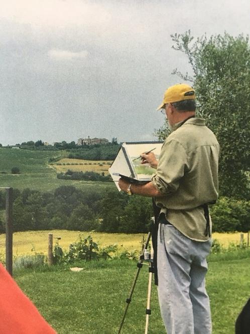
Portable plein air Easel, drinking water, hat, sunscreen, insect repellent, smart phone or camera to get reference photos, umbrella which can help to keep you cooler and keep the sun off your easel, but not entirely necessary. A portable Chair is also useful.
PAINTING TRIP SUPPLIES:
Mechanical pencils 0.5 or 0.7 leads HB and 2B, eraser.
Watercolor paints – recommended colors: cad yellow pale, yellow ochre light, gold ochre, burnt sienna light, burnt umber, sepia, ultramarine blue, cobalt blue, cerulean blue, cobalt turquoise, cobalt violet light , lavender, alizarin crimson, cadmium red and titanium white gouache. Right now my palette consist of only Daniel Smith and Holbein brand paints. Avoid student grade for strong results. Earth colors are all about the same.
Watercolor paper half sheet, or block approx. Size 15” x 22”. Paper is an essential ingredient as it determines the look of your surfaces. Find one you like and stick with it as being familiar with your papers absorbency and texture will give you more confidence in repeating predictable results.Good brands are,.. fabriano. Arches, Hahnmuhle Lanaquuarelle, I recommend Saunders CP ROUGH 140lb.
Or painting blocks ROUGH 11” X 15” CP
Or 16”X 20” ROUGH cold Press
Brushes of your choice. I suggest having at least three sizes: No 8, 12, and 14. I am using round Escoda Kolinsky No14, Escoda Perla No 10, 12, 14; sword liner brush – large. Rosemary Brush Co. makes excellent brushes in all these styles.
Water collapsible containers.
Spray bottle – small with fine mist.
Artist’s tape or masking tape if using sheet paper.
Gatorboard or corrugated light board cut slightly larger than watercolor paper if using watercolor paper.
Paint palette 10” x 12” or bigger with at least three separate flat mixing areas.
Paper towels
Sketch book or pad approx. size 9”x 12” you can make your own with your favorite paper its much more economical as well .
Portable plein air easel
Portable umbrella
Hat with the visor is recommended.
Sunscreen and bug spray.
Plastic bags for trash collection.
Wheeled cart to wheel all above or backpack.
Folding chair if needed (optional)
Helpful Info:
PAPER
hhtp://www.dickblick.com/watercolor papers
Easel
http://www.enpleinairpro.com
http://www.jerrysartarama.com/anderson-swivel-easel
Water jar
http://www.cheapjoes.com/collapsible-water-bucket.html
Dec 7, 2020
Architecture in Watercolor
- Introduction
What should you expect from taking this class? What will you take away?
Materials and equipment
A few words on Color Mixing
Some Terms to be aware of:- Perspective Overview
- Street view
- Birds eye view
- Worms eye view
- Extreme aerial view
- Looking uphill/looking downhill
- The Power of Light and Shade
- Casting shadows
- Light and Dark in composition
- Time of Day and temperature
- Drama and mood
- Perspective Overview
- 1st Class: exercise / Painting An Intersection in Easton
- Drawing and painting a study
- Find a focus point
- Editing the scene
- Vanishing points accuracy and simplification
- Planning the steps in your process
- Preparing your painting
- The under drawing
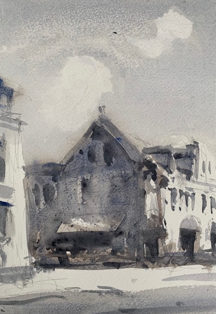
- The WASHES
- The first wash
- What to leave out and what to paint over
- The second wash
- Timing the soft edges
- Timing the hard edges
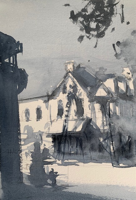
- The following stages
- Work in one area at a time
- Look for lost and found edges
- Putting “the bits and pieces”
- The first wash
- The FINAL Steps
- What phrase precedes a ruined painting?
- Take a break and let it simmer
- Where are the weak points? Can you strengthen them?
- Drawing and painting a study
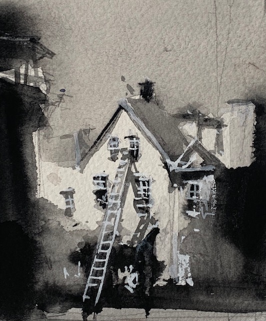
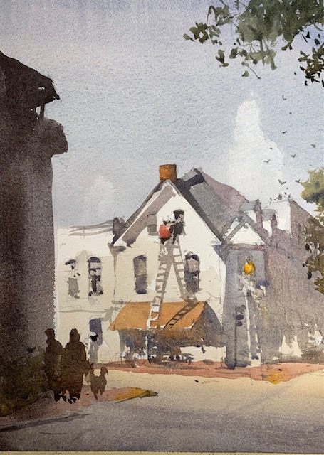
Week 1 reference photo 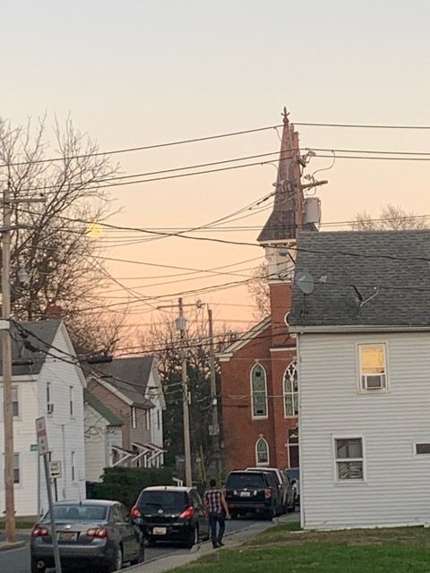
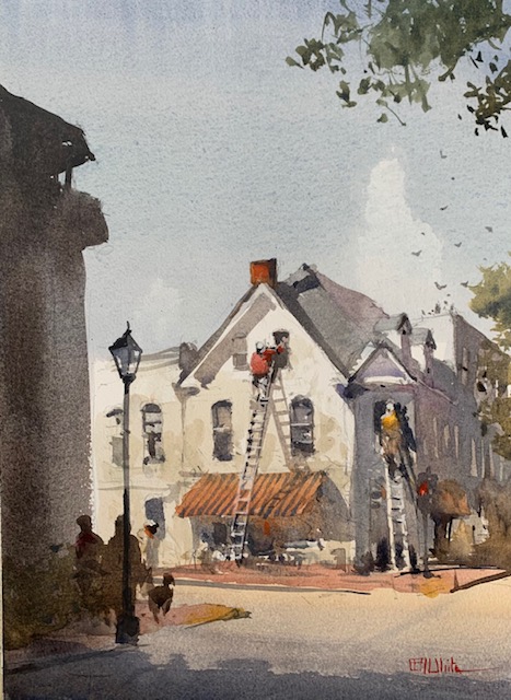
Week 2 reference photo 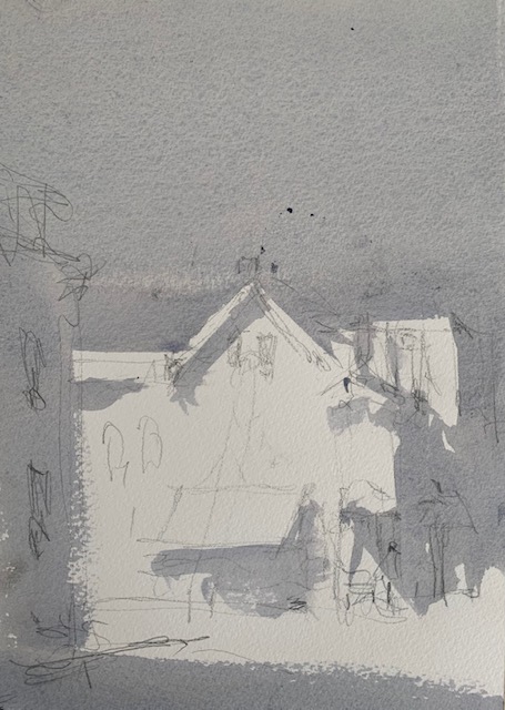
Dear Students,
Are you with me so far? Yes there are obstacles but we are going to get through those. Tomorrow I’d like to start a painting on graded washes to create mood and atmosphere. The image we are going to focus on is attached in this e-mail. To succeed in this exercise is to be able to create a smooth graded wash. That is a wash with no obvious streaking of colors. Just smooth gradations of color. In this image you will notice a gradation from a pale cool grey to a warm peach colored glow on the horizon. The architecture is simple enough. We will eliminate the power lines for this exercise.. The exercise will be done on a 14 x 10 piece of paper. . Before we execute the painting we will repeat last weeks exercise of doing a small study or 2. Then I’d like every one to practice this sky wash on separate pieces of paper. I will demonstrate how to get a smooth streak free wash going from cool grey to a warm orange color. It would be helpful for you to join along in this. If you can get this part right, most all of watercolor is pretty simple after this. The church and the modest houses around it are fairly simple to replicate. Remember that the value and NOT the color is important here. If you have any frisket I can show you how to show a rising full moon in this image.